Connect with execs from Axios, The New York Times, Paramount and more.
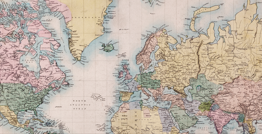
On Twitter, maps are everywhere –and you certainly don’t need a map to find one. And the primary proliferator of digital maps are publishers. In recent days, media outlets have shared maps made of food, maps about global GMO labeling laws, and even maps about states’ sex habits.
The sudden publisher interest in maps today makes sense, considering that — like top 10 lists and quizzes — maps are highly shareable. And the right kind of map can draw considerable viral attention back to publishers’ sites if executed correctly.
Maps like this one from Bloomberg about the history of missing Malaysian aircraft are effective and useful, because they can tell a story quickly, efficiently and visually. This is a big deal on social networks, where users tend to give content only a few seconds before deciding to skip it, read it or pass it along.
“The Web is a visual medium. And maps and charts are in a sense our equivalent of cat photos,” said Zach Seward, senior editor at Quartz, which developed its own software, Chartbuilder, specifically to create simple graphics quickly.
Justin Bank, audience and engagement strategy editor at The Washington Post, said that people on social networks appreciate and respond to publishers that try to break up the monotony of text with compelling visuals and easily digestible factoids. This idea is core to Washington Post projects like GovBeat, Wonkblog and KnowMore, all of which give the newspaper’s reporting a more social-friendly face. Three out of the five most recent GovBeat posts, for example, use maps to tell their stories.
“With maps, you’re able to squeeze so much story in a much smaller package,” Bank said.
One of the most successful approaches to Twitter and maps comes from Amazing Maps, a maps-focused Twitter account that has drawn over 140,000 followers since its inception last summer. The account’s success is particularly impressive considering that it is run not by a big publisher but three teenagers in the UK.
“Possibly the most successful of our posts are those that incorporate more popular data into map form — the data that people care about alongside the easy-to-read map format,” said the Amazing Maps team, whose members wish to remain anonymous.
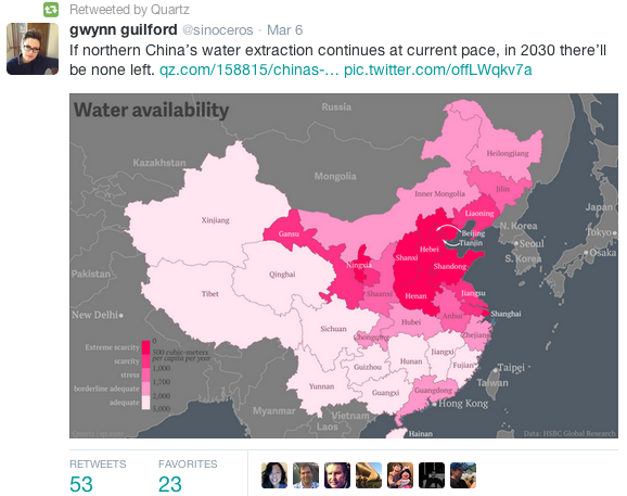
As with Quartz, Amazing Maps said that it started seeing even better results last October when Twitter started displaying images by default in users’ feeds. Seward didn’t have exact figures on how this shift affected Quartz, but a glance at the site’s Twitter profile shows that tweets with charts regularly draw two to three times as many retweets as those without them.
Quartz isn’t alone. Overall, tweets with images typically get 18 percent more clicks than those without images, according to social sharing app Buffer. Tweets with images also get retweeted 150 percent more, and favorited nearly twice as much, Buffer found.

“When you use visuals in social streams, you to get better results. Maps are a part of that,” said Edward Felsenthal, managing editor of Time.com, which has also seen major success with attaching visualizations to social posts — particularly on Facebook. Nearly half of the referral traffic to Time’s visualization on states’ moods, for example, came from the social network. The same goes for other recent successful maps, like this one about the “selfiest” cities in the world.
“Maps like these are ultimate interactive,” said Felsenthal. “It’s less about the image itself than it is about the ability to see where you are in relation to the data.”


More in Media

Media Briefing: Declared ‘good bots,’ mixed-use crawlers, gray scrapers – how AI accesses publisher content
The Cloudflare’s latest AI settings reshape how compliant crawlers behave, yet the biggest leakage for publisher content remains a gray scraping economy that doesn’t bother to play by those rules.

In Graphic Detail: The state of streaming highlights the power of creators
“Just Chatting” is the driving force behind views on major streaming platforms, thanks to the appeal of personality-driven creators

Hot Ones creator Sean Evans on YouTube vs. TV, the interview boom and what comes next
Hot Ones host and TIME 100 top creator Sean Evans chats about the creator economy’s past, present, and future