Everyone loves a good 404 page. Once a backwater of Web design, these pages are used to tell site visitors when they’ve reached a broken link. But a good 404 page can inject some unexpected humor and levity into a user experience that’s invariably dull and confusing. Publishers get that as well, and a few have truly upped the ante.
“I think that with anything you make, you should care about all the details,” said Bloomberg chief digital content officer Joshua Topolsky, who helped design one of the more unique 404 pages in recent memory for Bloomberg Politics. “This is just a little thing that we thought deserved consideration. Why not do something fun with it?”
To be sure, Bloomberg Politics isn’t alone. From Complex to Clickhole, here’s a look at some publishers’ more interesting, creative and downright strange 404 pages out in the wild:
Complex layers on the Kanye
Clickhole’s version of the Fail Whale is, well, a Fuck-Up Frog
The New Yorker digs into the archives
Vox: Let us explain
USA Today’s FTW scores on a fumble
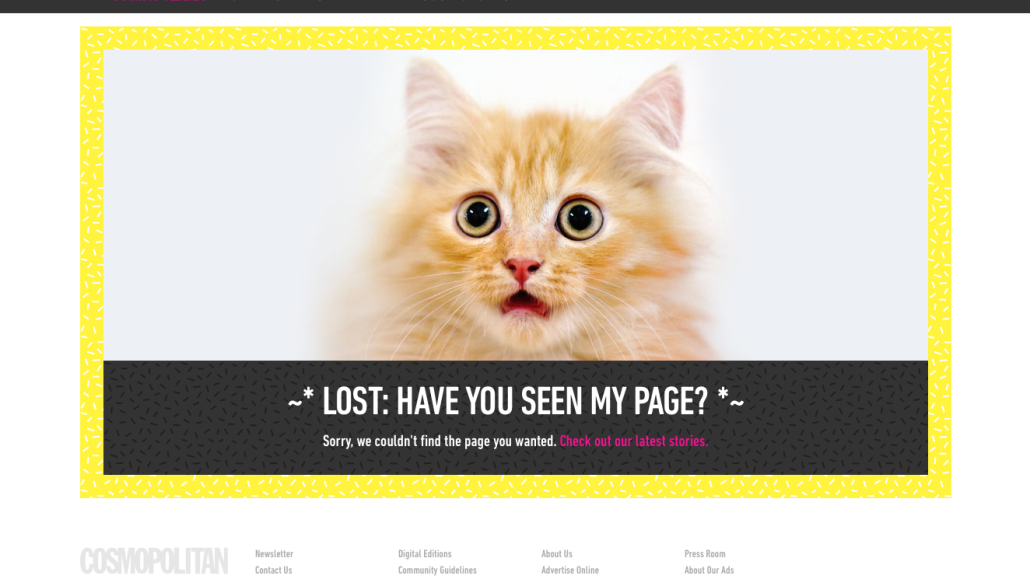
Meow you see me, meow you don’t
We see what you did there. Nerds.
Over at the Dodo, unicorns. Obviously
Funny or Die goes for the not-actually-that-funny, low-hanging Al Gore fruit
NPR: Here are some other missing things
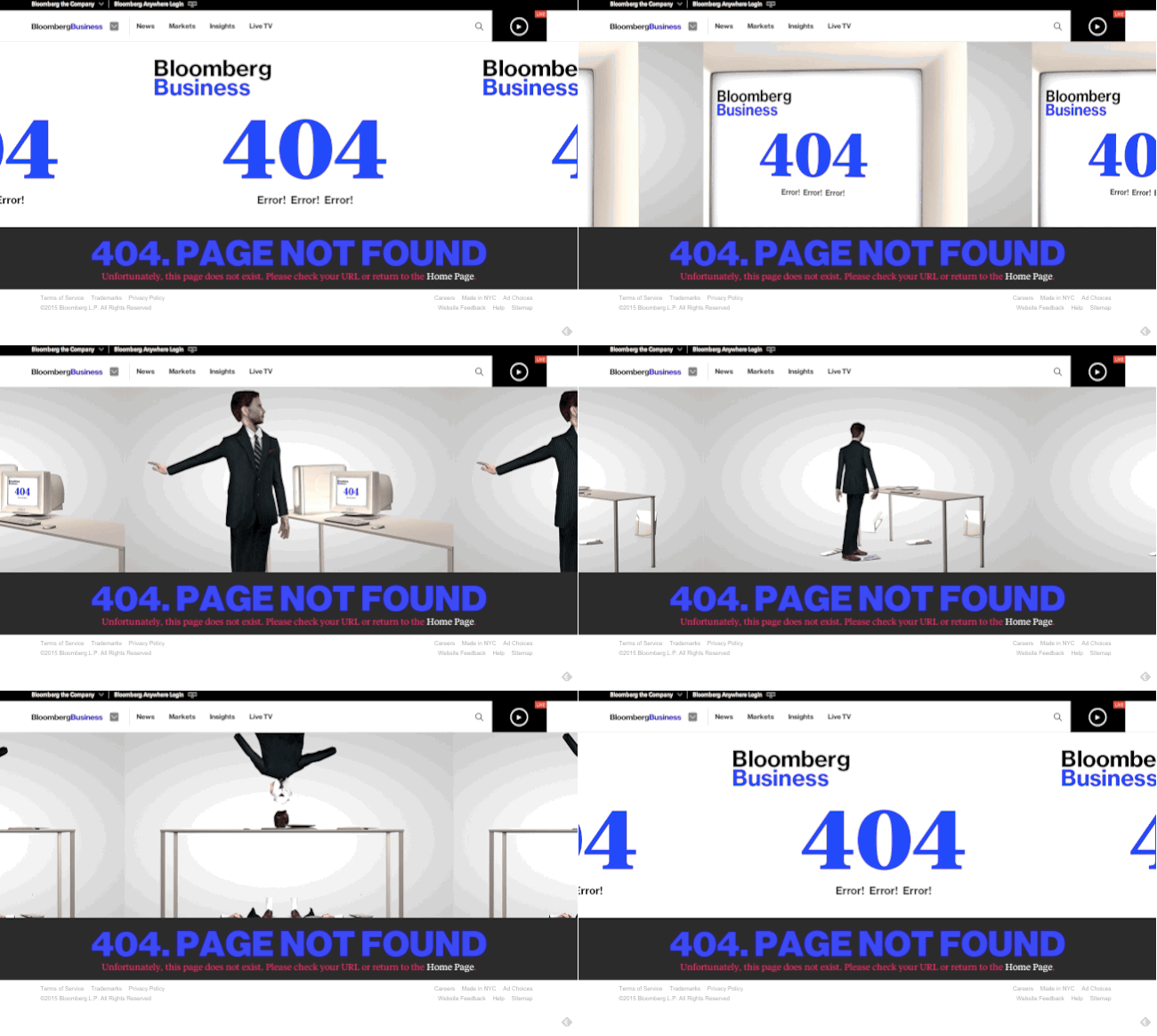
Bloomberg outdoes itself
More in Media

CNN builds in-house agent infrastructure as it prepares for AI-driven media trading
In Q3, it plans to test one or two properties to see how they’re interpreted by LLMs, before turning in Q4 to buyer behavior and whether budgets are being allocated toward agent-to-agent trading experiments.

How a ‘TikTok doctorate’ made 26-year-old Griffin Johnson a venture capitalist
Griffin Johnson made it big on TikTok back in 2019, now he runs a VC firm and uses his marketing expertise in the Derby world.

Media Briefing: Publishers debate the value of AI licensing and GEO
Publishers may be gaining visibility in AI search, but execs say the lack of traffic and licensing revenue is raising doubts about the payoff.


