
Digital media trends like viewability and infinite scroll may make industry headlines, but tactical decisions — like how big to make a social media button — can be just as important to publication design. With that in mind, we asked some experienced designers to share their favorite tactic. Here’s what they told us.
Steve Spurgat, managing director, Big Human
I posed this question to our design team. If you watch people use websites, they start at the top and scroll all the way down to the bottom. Put something down there for them to click on. It’s some of the most valuable space on a site. Time.com and Fortune.com — we put more and more content at the bottom of the site — and more.
Tim Dolan, group creative director, Huge
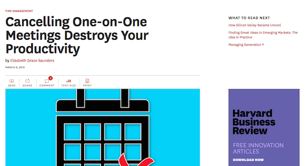
I primarily design for digital, and I’ve always made things a bit larger than you think they should be — like buttons and any kind of navigation. It’s about the negative space and letting things breathe, because we often try to cram in too many things. Design isn’t about how many things you can place on the page — it’s about how you can guide people. Harvard Business Review follows that thinking.
Robert Newman, creative media director at Newmanology
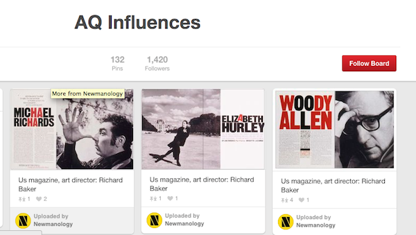
Right now my “favorite design trick” is to create a Pinterest mood board/look book for a project. This would include a collection of design samples and inspiration, photographs, illustrations, etc. I can send editors, photo editors, illustrators, photographer, and designers to the page, and they can see right away the aesthetic for the project. Everybody loves looking at Pinterest boards, and it offers a lot of instant inspiration. For example, I’m currently art directing a professional athletes magazine called AQ. We have a Pinterest board that collects a lot of design and image samples.
Felipe Memoria, partner at Work & Co.
In general, I’ve found that the best path is making the content clear and understandable, making sure main tasks are easy to accomplish and put front and center, and working hard to shorten load times. To me, it comes down to proportions and relationships. What matters most from a content and task standpoint needs to have the appropriate proportion compared to less important parts of the system. For example, at VirginAmerica.com, the booker takes the vast majority of the fold real estate. That’s what most users are interested in doing: booking flights.
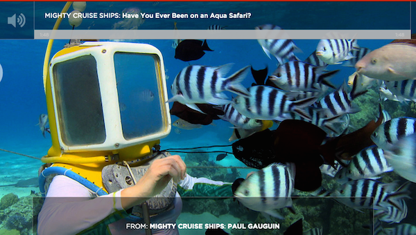
On another project of ours that recently went live, the Smithsonian Channel, if you click in a video page, like this one, the video, the thing that matters, is full screen, big, front and center, clear, beautiful. The UI is on top of it — if you request it. As opposed to having a small video player aligned to the left with a lot of other stuff around it like so many video pages on the Internet.
Kevin Kearney, CEO, Hard Candy Shell
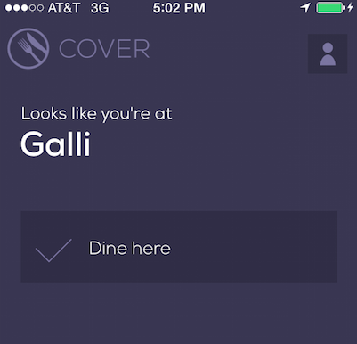
If there’s anything we always go back to when we’re getting into design details, it’s making sure that all the text we use on labels, buttons, instructions, and confirmation/error messages sound like it’s written for an actual human and not a robot. An example would be on the Cover app: When you open it, it says, “Look’s like you’re at” instead of “Your location is.”


More in Media
Why some publishers aren’t ready to monetize generative AI chatbots with ads yet
Monetization of generative AI chatbot experiences is slow going. Some publishing execs said they’re not ready to add advertising to these products until they scale or can build a subscription model first.
Media Briefing: Publishers who bet on events and franchises this year are reaping the rewards
Tentpole events and franchises are helping publishers lock in advertising revenue.

With Firefly Image 3, Adobe aims to integrate more AI tools for various apps
New tools let people make images in seconds, create image backgrounds, replacing parts of an image and use reference images to create with AI.