Last month, Washington D.C.’s Metro system experienced an unprecedented situation: It was shutting down for a whole work day leaving 700,000 people without a way to conveniently get to work. A massive surge of people clamored to hitch a ride, including on the city’s bike system and ride-hailing apps.
As commuter chaos swallowed the city, Bloomberg Graphics lept into action. The team created an interactive graphic called “Virtual Gridlock: Relive the Agony of D.C.’s Metro Shutdown.” For two of the maps (one showed the traffic during the morning commute and the other showed how many — or few — bikes were available on the Capital Bikeshare), the team pulled in publicly accessible data and overlaid it on a map.

But for the third map, highlighting surge pricing on Uber, the graphics team didn’t have the luxury of plugging data into their software because Uber only shares its pricing information publicly with individuals as they request a ride. So graphics reporters David Ingold and Adam Pearce manually requested dozens of rides from 20 addresses for four hours and took notes to see how high the price would climb.
“It was a low-tech and primitive way of getting data,” Ingold told Digiday. “But the reader doesn’t care, they just care about getting the stories.”
Ingold is one of 20 people working at Bloomberg Graphics, with reporters and illustrators spread across four bureaus including London, New York, D.C. and Hong Kong. The team collaborates with each other and Bloomberg’s reporters to create original graphics and interactives as well as graphics that supplement stories and broadens Bloomberg’s appeal.
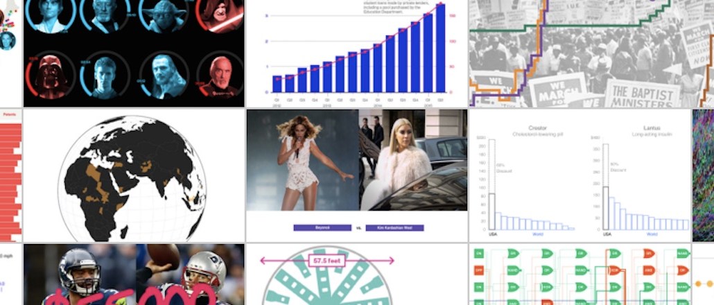
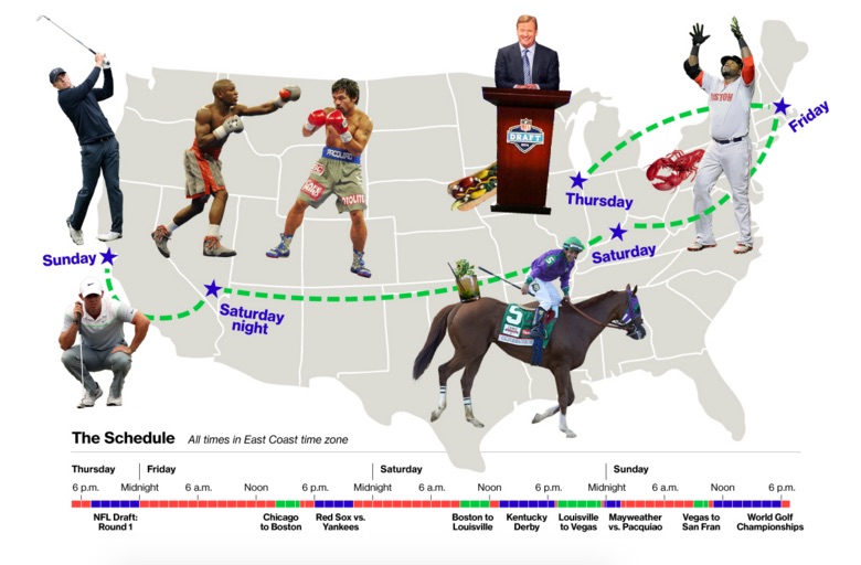
Recent illustration subjects include health, science, politics, sports and pop culture. The team isn’t under a mandate to exclusively publish graphics directly relating to stories published on Bloomberg, either. They can go after headlines and trending topics on their own.
“What’s going on in the world is what we’re going after,” Ingold said. “Our content can bridge gaps when there’s not any big business stories too.”
All Bloomberg reporters have an internal tool, called Toaster, that can whip together simple charts and graphs, but often go straight to Bloomberg Graphics if their stories are steeped in more complex data. “More often than not, reporters are excited to see their stories told visually,” said Chloe Whiteaker, a D.C.-based Bloomberg graphics reporter.
From there, the graphics teams pull out insights from the data that can inform an interactive, which can take days or even weeks. Sometimes, the data is pulled from algorithms they’ve created on their own to give them an edge over the growing number of upstarts focused on visual journalism. “If you’re the only person with the data, it’s easier to compete against competitors,” Ingold said.
The team’s original focus was to “make data beautiful,” Ingold said. Increasingly, they pepper in their own additional reporting into the graphics so people not only learn from their pieces but share it. The goal is to arrive at a minimum of one big takeaway, something that will inform and entertain readers, who will in turn feel compelled to share or embed the graphic on social.
The graphics team has a “good relationship” with homepage editors, where their work is often placed prominently on Bloomberg’s homepage. Traffic is funneled in from various platforms outside of Bloomberg’s owned and operated sites, with Facebook, Twitter, Reddit and even Hacker News chief among them. Roughly half of traffic is from mobile devices. Sometimes, the graphics are discussed on its radio network or shown on Bloomberg Television.
As such, the graphics team exposes Bloomberg to people who normally wouldn’t read the website. Their success has given the team “a lot of leeway to go for it,” Ingold said. Sometimes the more complex the issue is, the better.
“People are lazy,” half-joked Ingold. “We’ve done the work of finding the insights.”


More in Media
The Rundown: AI clones split the creator economy
Unauthorized AI voice clones and authorized digital twins are splitting the creator economy in half as brands, lawyers, and talent take stock.

The World Cup is a big chance for retail media to prove itself to advertisers
The World Cup, being much longer than other sporting events with more opportunities for campaigns, will likely serve as a case study for future retail media activations.

AI ‘girlfriend ads’ are fueling a new wave of MFA sites
AI-generated “girlfriend ads” are driving traffic to made-for-advertising sites filled with low-quality content and ads.