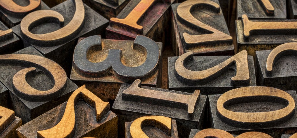
You may not know a serif from an ascender. But the font of a publication may be the most important thing that no one, except for designers, cares about.
It’s not surprising why. Fonts, by their very nature, work best when people don’t notice them. As some in the industry say, the best design is invisible. Just ask Cleveland Cavaliers owner Dan Gilbert, who in 2010 was eviscerated online for posting an open letter to LeBron James — in Comic Sans.
But all of this comes with with some problematic implications for publishers. At a time when more and more readers are first-time visitors who arrive through social media, publishers have only a few minutes to make an impression — and, hopefully, get people to come back. From a branding perspective, the font an article is in might well be as important as the article itself.
“It’s important for your return visits and trying to begin to build loyalty,” said Roger Black, design consultant at Font Bureau, a creator of custom fonts. “But most publishers, because of their current privations, aren’t really worrying about loyalty so much.”
Black, who has done design work for Rolling Stone, Newsweek and Esquire, said that most publishers today fail what designers call the “gutter test.” Rip a page from the New York Times and most people will be able to identify it — even when it’s floating alone in New York City gutter. Do the same for most websites and the situation will be very different. Most websites, Black said, just feel too similar, with the same general page layouts and font choices. That, as marketers would tell you, is bad for any brand.
There’s a balance here, of course. While publishers are eager to differentiate themselves online, being too creative with design threatens to alienate readers rather than attract them. Usability is more important on the Web than it is with a newspaper or magazine.
All of this is even more important now that publishers are interacting with readers not only in print and on the Web but on smartphones and tablets as well. This, in turn, demands a design experience that is consistent and carries a brand from one platform to the next.
“Brands should feel like a unified experience online and off,” said Susan Finkelpearl, director of user experience at development firm Alley Interactive. “Users should move from one to the other and back, and feel like the publisher’s values are coming through across all mediums.”
Fast Company has taken the notion further than most. Alongside its redesign in 2011, the magazine also hired designers to create a pair of custom typefaces, FC Kaiser and FC Zizou, which it uses both in print and on its website.
On the brand side, Intel also went as far as to create its own custom font, Intel Clear, which it debuted in April. Intel said the thinking behind the font was to create “optimal communication online” and “outperform other fonts across any medium.”
But even for publishers that don’t opt to create their own fonts, font choice can still say a lot. With the recent launch of Vox.com, for example, Vox Media chose sans-serif typefaces “Balto” and “Alright Sans,” the latter of which has ” just the right amount of warmth to convey a serious-yet-friendly tone, according to typeface foundry Okay Type.
“Sans serif typefaces say ‘modern’,” said Black. “So if you want to make a modern publication, that’s where you start.” Maybe it’s only a matter of time before Comic Sans comes back in style.


More in Media
Walmart rolls out a self-serve, supplier-driven insights connector
The retail giant paired its insights unit Luminate with Walmart Connect to help suppliers optimize for customer consumption, just in time for the holidays, explained the company’s CRO Seth Dallaire.
Research Briefing: BuzzFeed pivots business to AI media and tech as publishers increase use of AI
In this week’s Digiday+ Research Briefing, we examine BuzzFeed’s plans to pivot the business to an AI-driven tech and media company, how marketers’ use of X and ad spending has dropped dramatically, and how agency executives are fed up with Meta’s ad platform bugs and overcharges, as seen in recent data from Digiday+ Research.
Media Briefing: Q1 is done and publishers’ ad revenue is doing ‘fine’
Despite the hope that 2024 would be a turning point for publishers’ advertising businesses, the first quarter of the year proved to be a mixed bag, according to three publishers.