BBC, Guardian and Metro’s responsive makeovers: Who did it best?
British publishers are trying to make their sites more readable on mobile devices, but doing so can be a long and disruptive process. Few of the top U.K. news sites have yet to take the plunge into a fully responsive site redesign.
That said, the BBC, Guardian and Metro are among the early adopters. Take a look at how these three have approached their site redesigns, and cast your vote at the bottom of the article.
The Guardian
The Guardian set about redesigning its site from the ground up 18 months ago. This long process included public beta tests that allowed for reader input. It finally reached its last big milestone with a switchover in the U.K. this week. The site is built on a a flexible “container” format to help it assemble collections of stories on its homepages. It’s also using colors to sort stories by tone and importance, restoring the hierarchy of importance that is lost often in a sea of plain Web links. For example, red creates a feeling of urgency by representing live blogs of breaking news stories, while cooler tones like orangey-yellow reflect opinion pieces; violet means features, and black means it’s a video.
The new site has also been designed for speed: The site loads four times faster than the previous version. This clean, light-weight design won’t please everyone, though. Some of its users have been complaining about the front-page offering less news than it used to. Its colored tiles with contrasting headlines also take that little bit of extra effort to read.
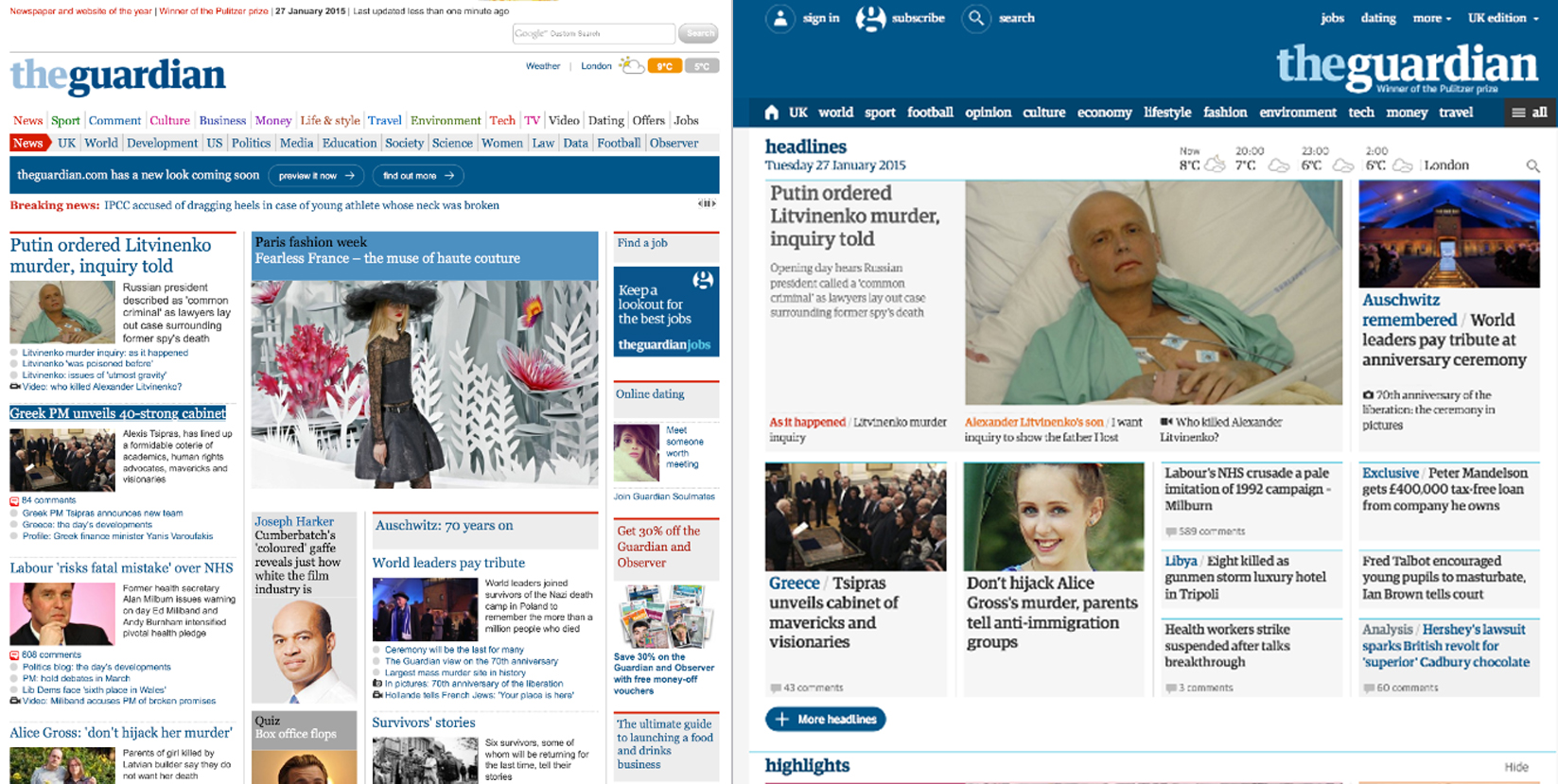
Here’s the Guardian’s homepage before (left) and after (right):
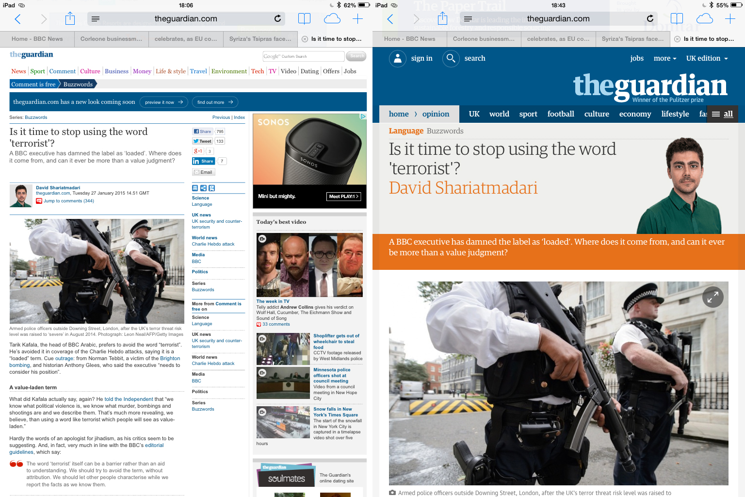
The article pages themselves have also been overhauled, as have video pages, live blogs and gallery pages. Columnists get high-resolution mug shots on the new responsive site. The best comment is also featured up top. The designers’ decision to have article summaries highlighted by color-coded headings fills out empty white space. That’s a common complaint made by desktop users of responsive sites.
On the advertising side, the Guardian now lets its advertisers serve a single creative execution that will adapt itself across all devices. The modular page design also allows it to insert ad formats in many more different places across the site. Previously, it was only possible to show full-width ads above or below the site’s header or footer. Assuming that the ad market will put an ever greater emphasis on view time in the future, the new modular architecture has already laid the foundation for developing the technical capabilities later on that such a shift in the ad market would require from publishers.
“There was a need for one unified site for all devices, as well as the need to cater to new content formats and commercial requirements,” strategy director Wolfgang Blau told Digiday late last year. “We publish around 500 stories a day. This new site [also] helps users identify different kinds of stories, by style, tone and relative importance.”
Alex Whyles, head of SEO and social media at Total Media, said responsive ad units will benefit agencies in the long run. “Display ads can be produced quicker and more cost effective as they will naturally size themselves based on the visitors screen size, no matter what orientation the screen is being held at – rather than the current process of developing multiple versions based on the available space on a website,” he said.
Here’s how the Guardian’s new article page looks (right):
BBC News
The BBC is continuing to roll out its new responsive news site: This most recent version is fully functional on smartphones, is in opt-in beta on tablet and to be offered as an opt-in on desktop within weeks. Even at this early stage, tablet users can see how the BBC is striving for greater consistency across devices with this new site. It has maintained a blog and has been responding to user feedback in introducing new features.
Senior product manager Niko Vijayaratham told Digiday that in addition to making f0r a nicer user experience, there’s a cost benefit to moving to responsive. Maintaining one platform rather than two is simply much cheaper, he said. Its journalists also benefit from a more efficient workflow by simply optimizing their articles for one site rather than two.
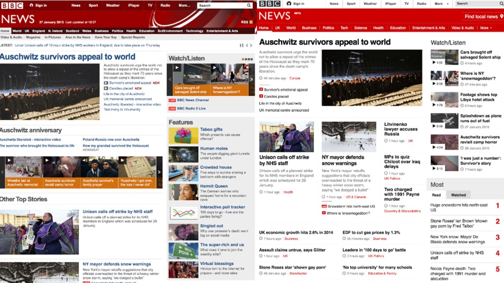
The BBC News homepage features stories without any of the shading or highlighting offered by the Guardian or Metro. The black text on a white background makes it a little more consistent, saving the readers’ eyes from having to adjust to each. The trade off is perhaps a less pretty but more efficient site to use. Star reporters get a new slot on the homepage, while its most innovative feature is its “find local news” button, which navigates to a user’s regional news page using the device’s location settings.
Here’s the BBC’s refreshed homepage before (left) and after (right):

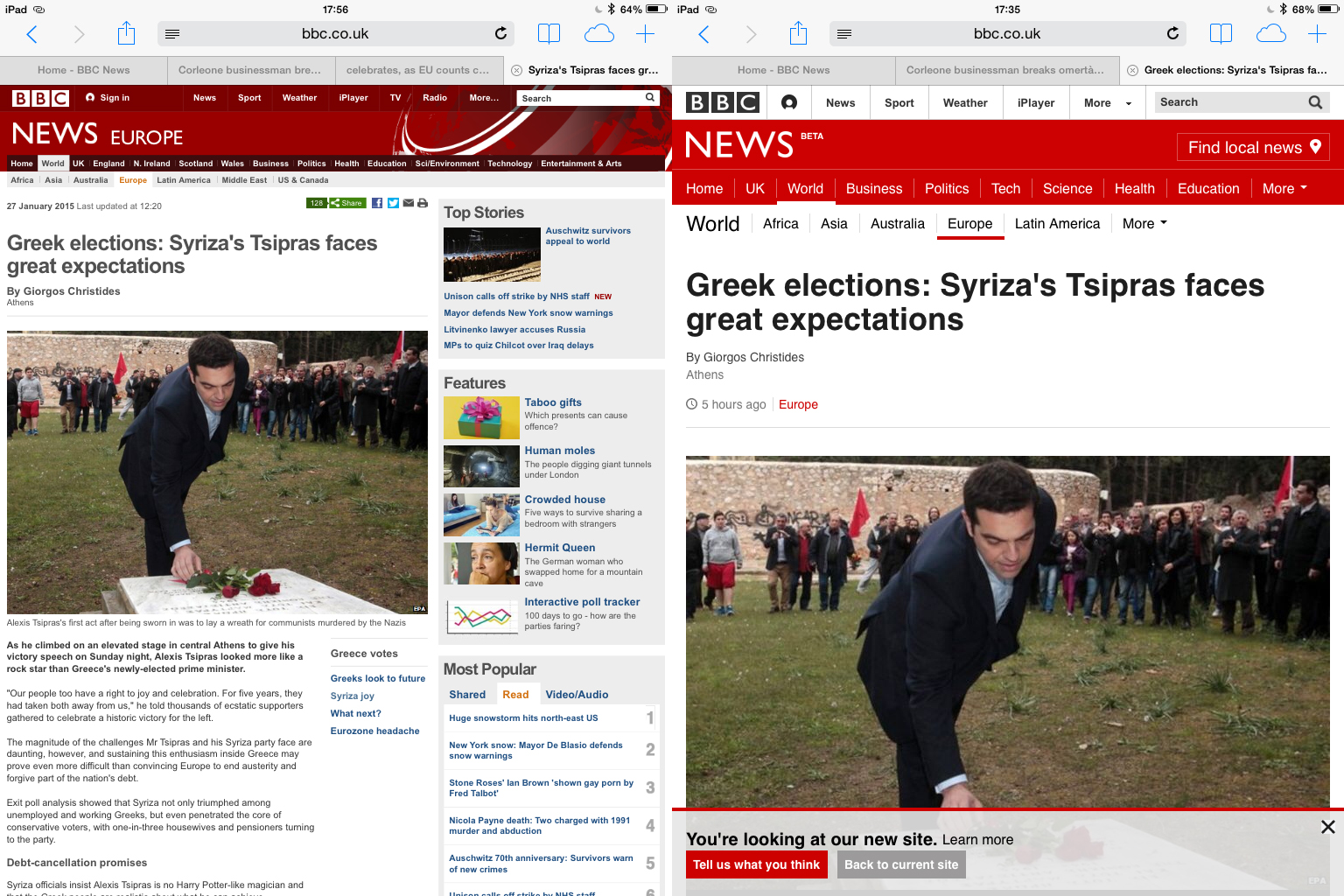
For its article pages, tablet users no longer have to pinch and zoom to make article text larger, plus the white space found on the desktop site is now filled with related content on the tablet. Its star reporters have round avatar images for their head shots, similar to user profiles on Medium or Facebook. BBC.co.uk attracted 52 million worldwide unique desktop visitors in December 2014, according to comScore.
Here’s how the BBC has tidied up its article pages so far:
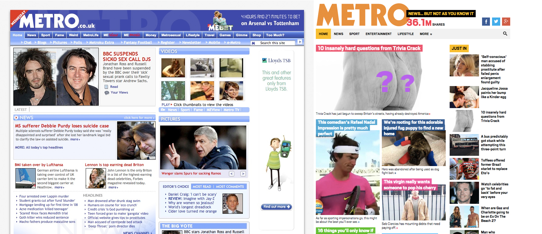
The Metro
The Metro newspaper brand was arguably the first major U.K. news provider to adopt fully responsive design. It made its transition in December 2012, when the concept was still new. Its original site was performing so badly, however, that it saw no issue going with a radical refresh. Before it made the switch, it was experiencing bounce rates of 90 percent for non-desktop users. Rather than build a separate mobile site, it decided to go fully responsive and has since enjoyed spectacular growth rates: Worldwide desktop audience effectively doubled in the two years since: from 2.8 million in December 2012 to 6 million in December 2014 on desktop, according to comScore. The company has reported huge mobile traffic growth over that same period and reports mobile traffic accounts for greater than 50 percent of weekend traffic.
Former Metro head of content Martin Ashplant, who has since moved to City AM as head of digital and social, told Digiday, “Responsive is a no-brainer for me, especially when you consider the impact of social, which is predominantly consumed on mobile. If you’re creating a site that doesn’t render particularly well on all devices, you’re shooting yourself in the foot.”
Whyles backed this rationale up. “Responsively designed websites have been Google’s preferred method for websites to deal with the increasing number of mobile/smart phone users accessing the Web,” he said. “Google has been championing this response over the past 18 months in order to ensure that visitors are indeed being given the best user experience when browsing online. This has been reinforced continually by Google as mobile searches are likely to overtake desktop searches in 2015.”
Its site has avoided the “white space” problem by going with large images and opting for white text headlines highlighted in a variety of colors. Its side bar disappears as the device or browser gets smaller, collapsing into two columns and then one as the browser decreases in size; its article page has a continuous-scroll functionality.
Here’s a before-and-after shot of the Metro’s homepage:
Who designed it best? Vote here.
[polldaddy poll=8618866]
Correction: This article incorrectly stated that the Guardian could now sell ads based on attention minutes, or view time. Actually, this redesign helps put the Guardian in a better position to do so in the future, but it is not a capability it has now. This post as been updated.


More in Media

With Firefly Image 3, Adobe aims to integrate more AI tools for various apps
New tools let people make images in seconds, create image backgrounds, replacing parts of an image and use reference images to create with AI.
Publishers revamp their newsletter offerings to engage audiences amid threat of AI and declining referral traffic
Publishers like Axios, Eater, the Guardian, theSkimm and Snopes are either growing or revamping their newsletter offerings to engage audiences as a wave of generative AI advancements increases the need for original content and referral traffic declines push publishers to find alternative ways to reach readers.
The Guardian US is starting its pursuit of political ad dollars
The Guardian US is entering the race for political ad dollars.