In news that will make Web designers everywhere smile, two big sites, The Huffington Post and ESPN, are planning redesigns in the coming months. Still, that leaves plenty of other sites that are in sore need of some visual attention.
Whether they fear changing a timeworn formula that works, they’re following the herd with the latest design tactic or trying to jack up their pageviews, a fair number of sites seem to be stuck in visual hell. We asked some designers to name their dream assignment and what they would do.
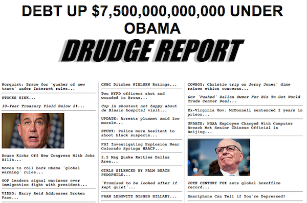
Drudge Report
Not a slave to design fashion, Drudge Report is a site that has changed little since its founding in 1996 as a mishmash of links to articles and columns from around the Web and occasional original stories. There’s no elegance, but that’s no surprise to readers, who tend to come not for an aesthetic treat but columns of headlines in typewriter-style font on a plain white background.

Robert Newman, creative media director at Newmanology, said while Drudge was always fun to read, it feels out of date considering how other sites have gone more visual. With a few tweaks, Drudge could keep its tabloid spirit while making itself more readable.
“It would be nice if the site looked more 21st century,” he said. “What could be done very simply would be a little color or graphical devices that give a little more hierarchy to the material.”
Newman also would lighten up the font with more white space to make it easier to read. “The smartest thing Drudge could do is get a new font that keeps the essence of the look, which is this typewriter, news-flash look but that’s more readable and more contemporary looking,” he said. “Just improving the font would be a big step forward for them and would not feel like its betraying the essence of what it’s all about.”
Time
Time.com spent a year and untold resources on its redesign that rolled out in 2014. It sported an endless scroll, responsive design, multiple article recommendations and new ad units optimized for viewability. And while it was an improvement over its predecessor, Dan Maccarone, co-founder of Charming Robot, felt it missed the mark by applying a mobile-first design to the desktop and cramming in too many article recommendations.
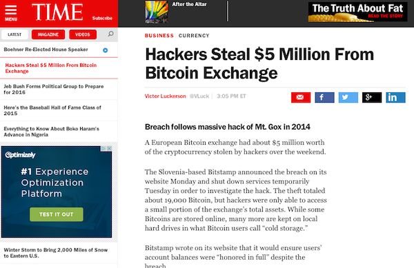
“The real problem is the article page,” Maccarone said. “It feels claustrophobic reading it with the locking header and sidebar. The more you throw at someone, the more overwhelmed they are. To me, it’s, ‘We know you’re not going to read this, so here are 25 more things you might want to read’ when the data show it doesn’t work. They went mobile-first, and mobile does not work on a desktop screen. On a mobile device, you’re probably going to scan a lot more quickly than on a desktop, where you have a lot more real estate.”
Time uses the widely adopted hamburger menu, and Maccarone is not a fan. “People don’t know what it is. It works really well on mobile where you don’t have a lot of room, where you have plenty of that on a desktop.”
The Wall Street Journal
The Journal may be the premier U.S. business daily, but that authority isn’t conveyed by its website, with its kitchen-sink approach to serving its readers. “It seems to go back to a time of ‘Let’s give people a lot of stuff, and they’ll find something,” said Jon Jackson, global creative director at Huge.
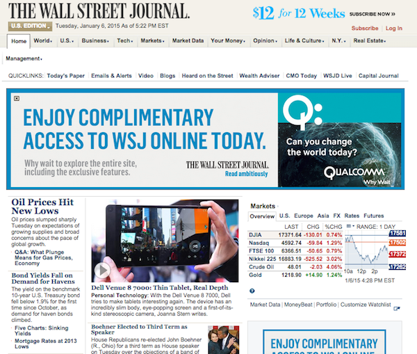
A news site serving busy business people should tell them what they need to pay attention to and give them a quick way to get informed about the top stories of the day. But Jackson said the lack of differential in the type size and uniformity throughout the home page make it difficult to tell what matters.
“There are so many columns, I don’t know what you should pay attention to,” he said.
One of the home page’s best features, “Popular Now,” is undermined by being next to the “Top Picks” module, creating reader confusion. Below them are stories by section (sports, world), but keep scrolling down and you’ll find more of the same. It’s unclear why stories appear by section in multiple places, but grouping stories on the same topic together would be a start to making the site more navigable.


More in Media
Digiday+ Research: Publishers take their focus off events as revenue dips
The percentage of publishers making money from events hit a low as of the first quarter of this year and, as a result, fewer publishers plan on putting a focus on growing that part of their business.
What platforms, brands and agencies hope to get out of the Possible conference in year 2
Year two of Possible is once again being held in Miami Beach, and it will take place from April 15-17 with 3,000 attendees expected to listen to another 200 or so speakers, including Snap’s Colleen DeCourcy, Uber Ads’ Megan Ramm and UM Worldwide’s Matthew Smith.

AI Briefing: Cloud giants’ AI ambitions create new partnerships — and new competitive concerns
Last week, tech companies like Google, Microsoft and Amazon all announced updates more updates for their cloud and AI efforts