For most publishers, there are two phases to a site redesign. The first happens behind closed doors, with user testing and internal work, with the grand public unveiling coming later. The Economist took a different approach over the past year. Choosing to draw out the introduction of its new site in order to gather feedback and make tweaks.
A year ago, The Economist had a new design ready to go. Rather than push it live and trumpet the new site in a press release, the publisher took a go-slow approach, showing it to just .5 percent of its visitors a year ago and steadily increasing the exposure over nine months while collecting and analyzing some 20,000 comments from readers.
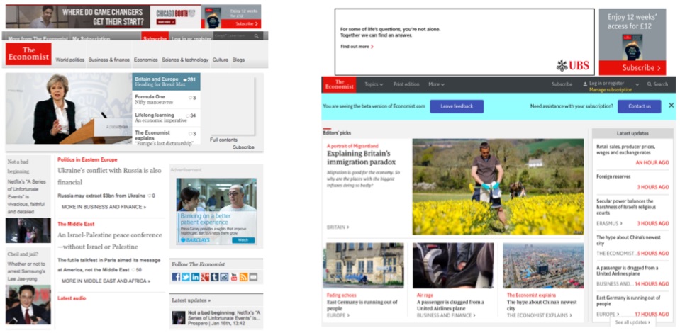
The go-slow approach allowed The Economist to make changes. For instance, The Economist found readers wanting more content on the homepage, despite designers typical love of white space. After increasing the number of links visible to readers on site, the number of people clicking through from the homepage to another article increased by 8 percent.
“We had made it cleaner and clearer, but we had nearly gone too far, people scanning for the news found that there weren’t enough links,” said Robin Raven, vp product and reader strategy, global circulation at The Economist.
The current homepage has a more uniform design than its predecessor, with content sorted neatly into cards. The number of topics in the main navigation bar has been cut from six to three, and the print magazine is given more prominence than before.
The Economist has also slashed the page-load speed of the second page people view after the homepage. According to Raven, the second page loads 80 percent faster than it did on the old site, which means people are reading more. Subscribers are consuming 10 percent more articles than before. Non-paying readers, who register their email address to get three free articles a week, are consuming 12 percent more articles than before.
Page latency remains a persistent headache for publishers, and The Economist will fiercely monitor the progress. There’s still room for improvement. Google’s speed test rates The Economist as 67 out of 100 on desktop, while on mobile it’s a little lower at 57, (The Financial Times scores 90 out of 100 on Google’s speed test.)
The start of the process was to examine what the Economist.com is used for. “It’s like a dice: it has many faces,” he said, a concept he has delved into previously in a Medium post early on in the project. As well as a shop window for content, the homepage is also the most popular channel for readers to buy a subscription through.
Although The Economist’s hybrid ad and subscription model means it isn’t beholden to digital ad revenue, the homepage is still critical for serving ads. The number of ad units remains unchanged, at three, but the time an ad is in view has increased by an average 30 percent.
On mobile, where it gets around 75 percent of its traffic, according to comScore, The Economist has cut its infinite scroll feature, where each article rolls into the next. “One of our promises is that we are a trusted finishability filter. The infinite scroll didn’t chime brilliantly with that promise,” said Raven.
For this same reason, it approaches personalization carefully, believing that “subscribers pay for us to do that editing for them.” Rather than let readers create their own feeds, The Economist has bundled content around similar themes, like Brexit, or tech reports, and made them more visible on the homepage. “The collections allow people to see the breadth of coverage, while also feeling informed. Previously the collections weren’t as intuitive,” he said.
The plan is to keep tweaking the site, speeding up load times more, and adding new features. Previously The Economist would release code changes, such as bug fixes, or feature updates, batched together on a weekly basis. That used to create workflow blockages, with valuable updates waiting in a queue. Now the team works to a continuous deployment model, updating code as and when needed.
Raven wouldn’t share how many people are in The Economist’s engineering team, as it varies depending on the project, though he said it is lean. This project involved a spectrum of people from the organization, including infrastructure engineers, user experience designers, graphic designers, front and back end developers.
“We didn’t look at the metering element as part of this project, we had to draw a line somewhere, finding the right timing for the paywall to fire is something we will be focusing on.”
Images: courtesy of The Economist via Facebook.


More in Media

Meta AI rolls out several enhancements across apps and websites with its newest Llama 3
Meta AI, which first debuted in September, also got a number of updates including ways to search for real-time information through integrations with Google and Bing.
Walmart rolls out a self-serve, supplier-driven insights connector
The retail giant paired its insights unit Luminate with Walmart Connect to help suppliers optimize for customer consumption, just in time for the holidays, explained the company’s CRO Seth Dallaire.

Research Briefing: BuzzFeed pivots business to AI media and tech as publishers increase use of AI
In this week’s Digiday+ Research Briefing, we examine BuzzFeed’s plans to pivot the business to an AI-driven tech and media company, how marketers’ use of X and ad spending has dropped dramatically, and how agency executives are fed up with Meta’s ad platform bugs and overcharges, as seen in recent data from Digiday+ Research.