Uber unexpectedly revealed a new logo, confusing everyone
Uber hailed itself a new logo today.
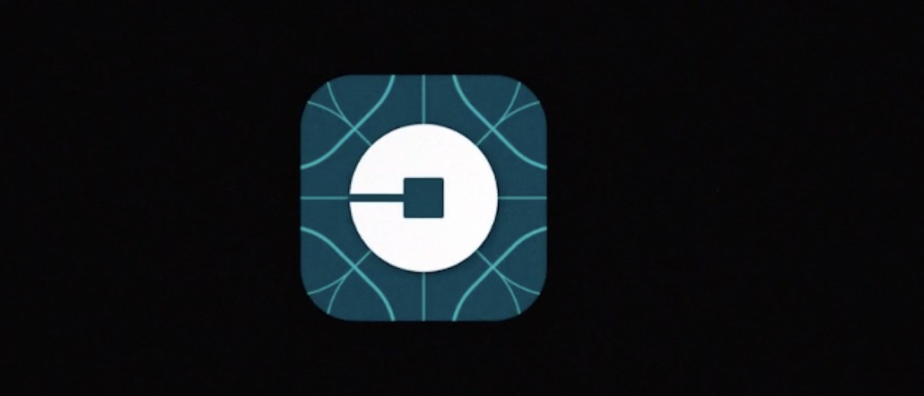
The on-demand car service app shed its four-year-old look, ditching the stylish “U” embossed on a black badge, replacing it with a backwards “C” with a square in it that the brand is calling a “bit.” In a blog post, Uber says that the identity better represents the brand’s shift beyond grabbing a car, describing it as a “new look and feel that celebrates our technology.”
The redesign has been underway for two years. Uber explained that its old black-and-white scheme was “distant and cold.” Now, there’s a plethora of colors that change depending where the customer is using the app in inspired by its surroundings.
“The team has spent months researching architecture, textiles, scenery, art, fashion, people and more to come up with authentic identities for the countries where Uber operates,” writes Uber cofounder Travis Kalanick.
Another big change is the font, which is describes as “more grounded and elevated.” Similar to Facebook’s recent logo tweak, the new logotype looks better on mobile screens.
The identity comes with a overly reflective video explaining the look, too!
Celebrating Cities | Uber from Uber on Vimeo.
Snap judgement from Twitter suggests that people hate it, which isn’t surprising since when has the Internet ever liked a new logo?
Thought that new @Uber logo looked familiar. Better call Robocop. pic.twitter.com/HdFKSp8XVQ
— Pete Pachal (@petepachal) February 2, 2016
all I can see when I look at the new Uber logo pic.twitter.com/61UvaJWg8n
— Millenielle Falcon (@TheMillenielle) February 2, 2016
New @Uber app logo is bad & makes zero sense.
— Liam Bonner (@LiamBonner) February 2, 2016
is the new uber logo supposed to resemble ancient chinese coins? is the regional push all about competing 4 china? pic.twitter.com/o3XmZ0Kccy
— Adam Janofsky (@AdamJanofsky) February 2, 2016
Susan Cantor, the president of Red Peak Branding echoes those sentiments, questioning why Uber ditched its well-known U.
“Unfortunately, I don’t think the new design helps communicate this change. It feels like a map icon or a navigation tool — nothing more — and by failing in design, Uber has undermined the larger strategic platform they want and need to communicate,” she told Digiday.
Uber’s new look comes on the heels of competitor Lyft’s own recent redesign, which it rolled out last year.


More in Marketing

Why the New York Times is forging connections with gamers as it diversifies its audience
The New York Times is not becoming a gaming company. But as it continues to diversify its editorial offerings for the digital era, the Times has embraced puzzle gamers as one of its core captive audiences, and it is taking ample advantage of its advantageous positioning in the space in 2024.
Why B2B marketers are advertising more like consumer brands to break through a crowded marketplace
Today’s marketing landscape is more fragmented than ever. Like consumer brands, business brands are looking to stand out in a crowded and competitive marketplace, making marketing tactics like streaming ads, influencers and humorous spots more appealing.

As draft puts WNBA in spotlight, the NBA is speeding up ballplayers’ transition to creators
The NBA’s star athletes are its greatest marketing asset.