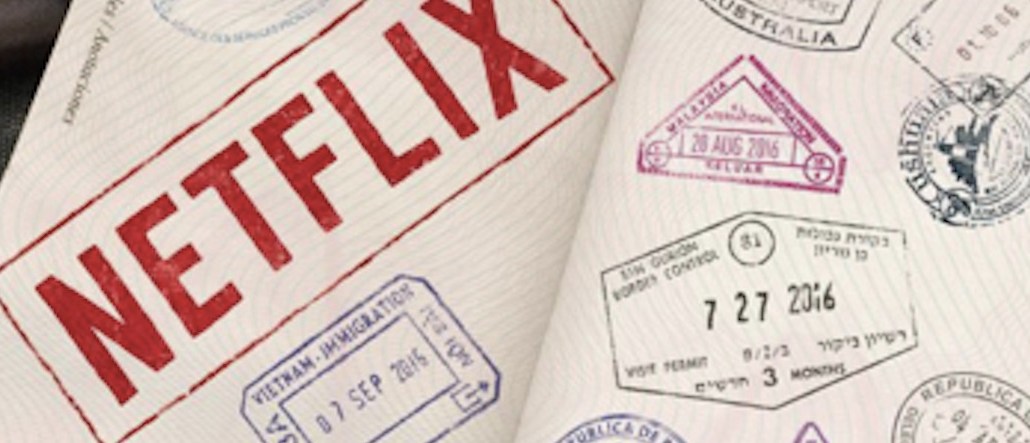
N stands for Netflix’s — and it also stands for “new.”
The streaming service rolled out a new “N” emblem today across its Facebook, Twitter and Instagram profiles surprising its users. The red N, which replaces the full brand name, follows the flat, so-called “material design” trend that’s seen in recent Google, YouTube and Instagram redesigns.
Netflix isn’t ditching its red and white logo it unveiled in 2014. Rather, the redesigned “N” is a new element for its mobile apps and social media profiles. The full “Netflix” word will still be used on advertisements and show bumpers.
Reactions were mixed:
Another week, another logo fail… What the hell is this #netflix 2003? pic.twitter.com/mRmu2JnC2N
— Dam (@DamsTweets) June 20, 2016
New Netflix logo… pic.twitter.com/vT4qviBzVo
— Linda (@bangbangbruja) June 20, 2016
I like the new @netflix logo pic.twitter.com/OH1C0EFudX
— Jose del Corral (@J0se) June 20, 2016
And someone already posted a think piece about the change on Medium, calling it “cold” and “not needed.”
Netflix is the latest tech company to freshen itself up, following revamps from Facebook and Uber.


More in Marketing
Q1 ad rundown: there’s cautious optimism amid impending changes
The outlook for the rest of the year is a tale of two realities.
WTF is the American Privacy Rights Act
Who knows if or when it’ll actually happen, but the proposed American Privacy Rights Act (APRA) is as close as the U.S. has ever come to a federal law that manages to straddle the line between politics and policy.

Here’s how some esports orgs are positioning themselves to withstand esports winter
Here’s a look into how four leading esports orgs are positioning themselves for long-term stability and sustainability, independent of the whims of brand marketers.